Color Blocking Strategies: Make Your Brand JUMP off the Shelf! 3/10/2019

Unless you are looking only to win awards, the true test of effective packaging design is how it makes the product jump out on the shelf and – ultimately – into the consumer’s shopping cart. Yet many packaging designers fail to take this fact into consideration, and don’t test their designs on an actual store shelf next to competing products. After all, your product will not be sitting alone on the shelf as it does on your computer screen. You need to see what how it looks in a real retail environment to truly judge the effectiveness of the design.
By evaluating the colors and designs of products that will sit alongside yours on the shelf, you can optimize your color blocking to really stand out among them.
Color block merchandising is the retail sales strategy of organizing products by color to attract the eye of browsing shoppers. It’s a subliminal technique that the average consumer doesn’t notice, but that works in creating an attractive experience that leads them to take action and buy multiple flavors or items.
Retailers use it when organizing high sales velocity locations like end-caps and front of store displays to sell products. But brands can also design with blocks of color within their product line to make their entire line stand out next to the competition and entice retailers to include more products from the line.
To maximize the chance your product looks good in color block merchandising, brand owners should use complementary colors. The human eye is naturally attracted to rich complementary and contrasting colors, and creating color cohesion across your product line will help the entire line stand out.
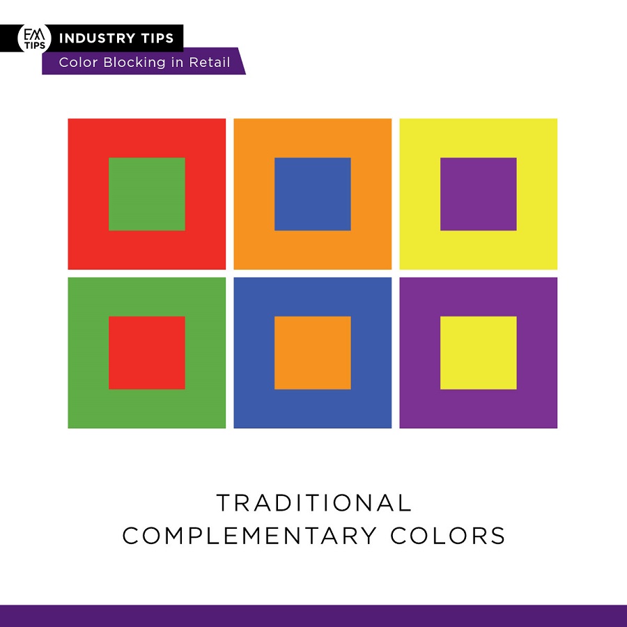
According to Wikipedia, complementary colors “are pairs of colors which, when combined or mixed, cancel each other out (lose hue) by producing a grayscale color like white or black. When placed next to each other, they create the strongest contrast for those two colors. Complementary colors may also be called ‘opposite colors.’”
As a brand owner or a packaging designer utilizing color blocking means looking at the color wheel and picking colors on the opposing end within your color family
In-Store Effectiveness
As a brand owner, it’s crucial to think about how your product will look in stores before designing your packaging. Using this strategy will benefit you in two ways:
- For everyday shoppers, when you design the product line with complimentary colors, you maximize the chance the eye on the shelf in a grocery store.
- For retailers, they will be more likely to feature and highlight your entire product line in stores in color block merchandising on an end-cap or display where sales velocity is on average higher if you create products that will work well. Plan to design in a way that will help your retailer create a beautiful eye catching in store experience that helps them converts to sales. The more you plan with the retailer's color-block merchandising in mind, the greater the chance of success in getting one or more items of your product line on the shelf.

Things That Work
Here are some ways in which you can effectively deploy color block merchandising:
- Brightness: Bright colors seem to trigger a positive response in our brains tied to recognizing healthy and ripe, ready to eat fruits by their juicy shades.
- Shading patterns: Use shading to emphasis and make fonts or logos more bold. Minimize the use of shading or patterns that can appear to create a shadow or dampen bright colors.
- Using a color wheel: A color wheel is an abstract illustrative organization of color hues around a circle, which shows the relationships between primary colors, secondary colors, tertiary colors etc. Use a color wheel to find the colors that both contrast but belong together to create cohesion.
Things To Avoid
Here are some things that can cause issues when trying to effectively deploy color-blocking
- Darker Shades: Lots of dark shades of color, especially in a category where other colors are bright – poor lighting in stores can result in your product looking like it’s in the shadow and it will be missed by the browsing eye.
- Colors not in the same color family: It’s important to pick colors that go within a family so there is cohesion inside the product line which creates subliminal natural appeal.
- Small fonts: Font sizes that are too small or design embellishments that disappear when far away on the shelf.
- Colors too close to each other on the color wheel: Color blocking’s success requires variance or contrast to draw attention.
Actions You Can Take Today
Prior to making any mass production runs, print a mock-up of your packaging and take it into your local retailer and place it on the shelf against the competition. Make adjustments and repeat as necessary until you get the colors that pop against the other products on the shelf. In addition, walk the store store as a brand owner and product developer to study what is going on in that environment, and evaluate the trends and patterns on the shelf as a source of inspiration and application before your next packaging artwork revisions.
Packaging design for retail is the art AND a science of capturing the browsing shopper’s eye in a grocery store. This unique environment often has florescent lighting, shadows created by shelving and requires your product grabs attention of a consumer from the peripheral view of your customer. If you want to be sure your products sell there, it’s important to design with these unique elements in mind.
One of the best ways to do this is planning your packaging artwork for your entire product line to work in a grocery store, not just on a computer screen. Use a color wheel to create cohesion with complementary colors for each SKU in your line so it naturally creates a colorblock on the shelf. This will make it easier for retailers to create to create a better shopping experience in stores and increase the likelihood your product ends up at checkout.
Best-Practice Examples of Complementary Color Use
Below are some examples of beautiful brands that thought of this concept while still at the drawing board and that works wonderfully when on the retail shelf.
The Perfect Bite Co frozen appetizer line is perfect for at gourmet home entertaining without hiring a caterer, available in your local grocery store. The line together is color-blocked to better highlight each induvidual product within the line.
.jpg)
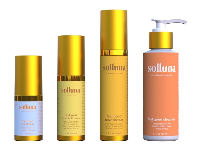
Solluna Skin Solutions are organic beauty products by health influencer and NY Times Best Selling Author Kimberly Snyder. Check out the beautiful sunny interplay of their colors that work wonderfully on shelf AND on their website:
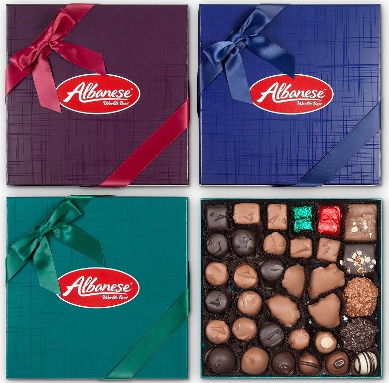
Albanese Chocolate Boxes: Best known for their wildly famous gluten free gummy bears, this confectionery brand also makes these gorgeous All-American gourmet chocolates.

Best Practice Examples of Color-Block Merchandising In stores
Retailers below effectively used color-blocking to make the various products in the brand's line POP!
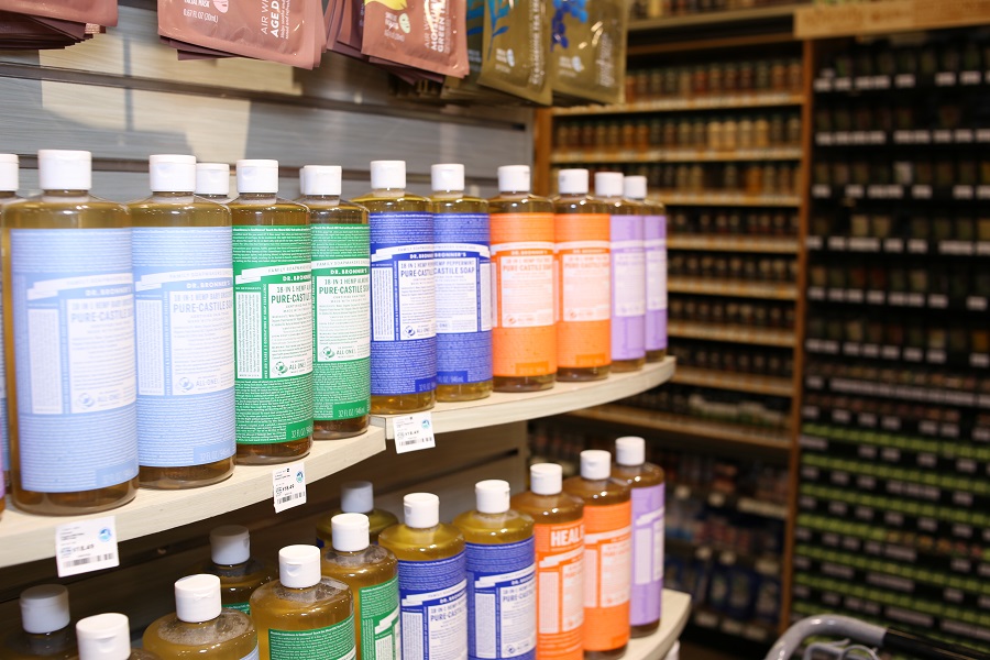
Dr Bronner’s products strategically color blocked in an end cap of a beauty aisle by this retailer
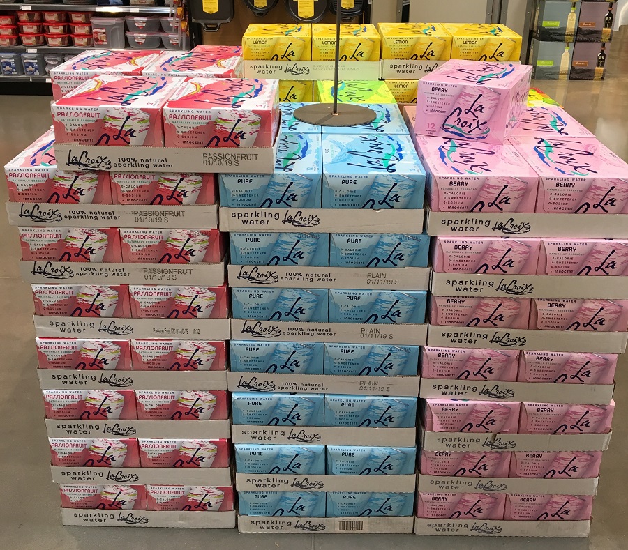
La Croix brand packaging colors naturally creates a color block on a pallet in the store

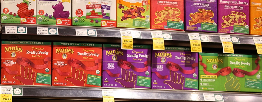
Annie’s Organic Fruit Snacks uses bold colors to create cohesion across their product line on the shelf

Editor's note: Emily will be presenting about product packaging design strategies during ECRM's Store Brands Summit next month in Las Vegas. Click here for more details!
All graphics by Kat Reyes, VP of Brand & Marketing at Pearl Resourcing

.jpg)


Emily Page has over 12 years of experience in selling consumer brand products in the food industry with packaging. She is the CEO and founder of Pearl Resourcing (http://pearlresourcing.net), an international packaging and product development company where she has launched multiple 7-figure brands into retail and e-commerce with 2-5x growth in sales.