The 3-Second Rule: Designing a Perfect Package Front Panel 4/26/2022
.jpg) Three seconds. That’s all the time your product has to grab the attention of a busy shopper racing down the aisle. In that brief moment, your target consumer must be able to instantly understand exactly what your product is, what it does, how it’s different and most importantly, WHY they should buy it.
Three seconds. That’s all the time your product has to grab the attention of a busy shopper racing down the aisle. In that brief moment, your target consumer must be able to instantly understand exactly what your product is, what it does, how it’s different and most importantly, WHY they should buy it.
Not only must this be accomplished quickly, but also from a distance of up to 10 feet away, on a crowded shelf, surrounded by other products that are also vying for the shopper’s attention. This immediacy is crucial, as your target consumer is likely in a hurry, may have a screaming child in tow and might not be looking for or even aware of your product. They are simply too busy, impatient, and distracted to take the time to figure out what they are looking at unless the messaging is crystal clear.
Which is why the design of your product packaging’s front panel is so important. It’s your product’s billboard. It must instantly STOP the shopper in her tracks and get her to either add your product to the basket immediately, or at a minimum, take it off the shelf to learn more.
Less is more
When it comes to front panel packaging, the fewer words and graphics there are, the better. Strive for one graphic image and no more than three callouts that clearly announce the product’s primary benefits and are large enough to be seen and understood from a distance.
These callouts can run the gamut to descriptions of value, functional benefits, special ingredients, an addition of something (vitamin-fortified, for example) or the subtraction of something (free-from, etc.). It may highlight a certification, the fact that it’s locally-made or that the company is a diverse-owned supplier.
'When it comes to front panel packaging, the fewer words and graphics there are, the better.'
But how do you determine which callouts to highlight on the coveted space of the front panel packaging? For that, you have to get insights from your two key audiences: consumers and retail buyers.
Asking your target consumers through various consumer research venues what is most important to them about your product, consulting with knowledgeable retail buyers, and heeding the advice of consultants familiar with your category are the best ways to know for sure.
Also, it’s a good idea to scope out the competition in a real-life setting: the store shelves. Check out the brands on the shelf where you envision your product sitting. Study the designs of their packaging’s front panels. This will help you to select the colors, fonts and callouts that will help your product truly stand out among them.
Once your front panel has done its job to stop the target consumer to pick up the package, the copy and application graphics and supporting product features and consumer benefits can be incorporated on the back, side and bottom of the package in detail.
In contrast to the front panel, the remaining areas of packaging can have more information, smaller print, and can be more informational versus eye-catching. Here you want to include all of the additional details you may need to provide all of the additional information that may be needed to close the sale.
What NOT to include on the front panel
While you want to develop a long-term profitable sustaining brand franchise and household name, it makes no sense to devote an inordinate amount of space on the front of the package initially to a brand name, logo or an image that is unknown or unrecognizable, particularly if you are a new or emerging brand. In fact, most front panels of new brands are guilty of way too much clutter, which is the reason so many new products fail. If you haven’t developed strong brand equity yet, emphasizing your logo will not help.
Your product may have 10 amazing product features and benefits, but the front panel of your package is your primary billboard, with only enough room to discuss, at most, two or three such benefits along with one visually attractive and compelling call to action. Select the ones that – based on your research – will have the most impact. And don’t be afraid of empty space. This can be a good thing on the front panel, especially when it draws attention and directs the eye to the callouts.
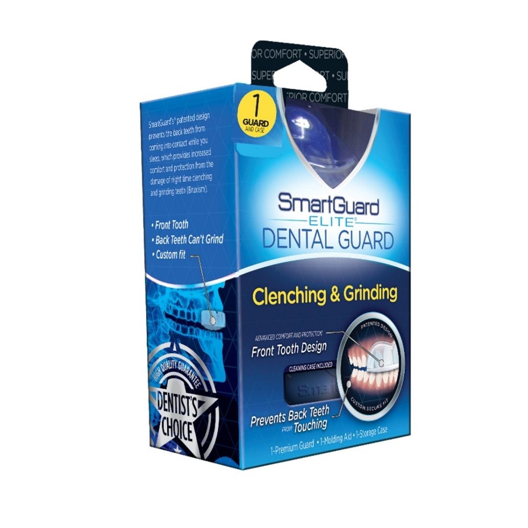
SmartGuard example
SmartGuard is a brand I’ve represented for years and is a best-in-class example of an impactful packaging front panel. As you can see from the image above, the design is simple, with plenty of empty space so that the main callouts truly stand out. “Clenching & Grinding,” the key issue it addresses, is set off from the rest of the copy with a different color, and the two features, “Front Tooth Design,” and “Prevents Back Teeth from Touching,” long with a descriptive yet simple graphic, are the only callouts on the package. Everything the target consumer needs to know can be quickly and easily identified as they scan the shelf. Additional details are on the back and side panels, one of which is visible in the image.
So when designing your packaging, make sure that every word, graphic, color and empty space on the front of the package is evaluated by one criterion and one alone: will it stop the consumer and get them to pick it up off the shelf?
At the end of the day, that’s what matters most.

A CPG veteran with 41 years of sales and marketing experience, John O'Maley has helped brands launch 185 products successfully into the U.S. retail market with an expertise in manufacturing, sales, marketing, advertising and business development. He has participated in more than 285 ECRM sessions.